Graphic tote bags have become incredibly popular in recent years. They’ve made a comeback for obvious reasons; they’re versatile, practical and a fashion accessory too. Tote bags are ideal for carrying groceries, books, and other essentials, and their large size means that they can hold a lot of items. Plus, tote bags are reusable and eco-friendly, making them an attractive alternative to single-use plastic bags.
Why do brands use tote bags?
They are often used as a way to make a statement or show support for a particular cause or brand. For example, many organisations now sell tote bags with slogans or logos to raise awareness and funds for their cause.
Why are brands pushing the creative boundaries when it comes to their tote bag print graphic design?
Because no one wants to use a boring tote bag.
Another reason as to why graphic tote bags have become so popular is that they are highly customisable — with more creative freedom your brand has the ability to tell a story. This means that people can express their personality and individuality through their tote bag choices, whether it be a bold and colourful pattern or a minimalist design.
Here’s 25 cool graphic tote bag designs that really pop!
Check them out and be inspired for your next graphic tote bag design.
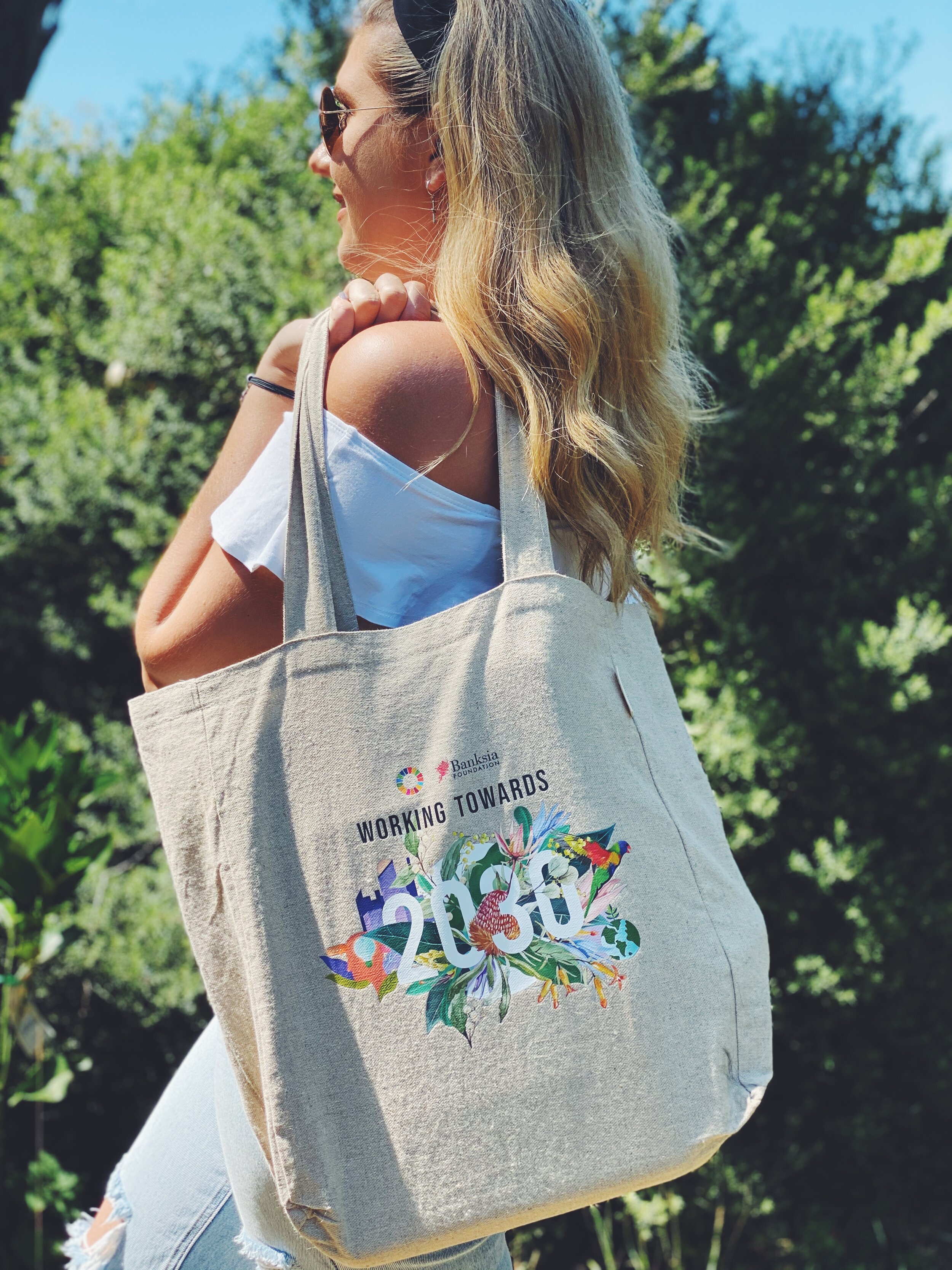
- Banksia Foundation Working Towards 2030 — Floral accent
This is a classic floral style that has been used on many tote bags before. This design brings focus to one particular word, number or year on the tote bag design. For example, on the Banksi Foundation ‘Working towards 2030’ design, flowers are growing around and coming from behind the year ‘2030’. This draw your attention to the focus point of the design, but in this case, also tells the consumer that the floral design has a sustainability double-meaning to it as well.
Banksia Foundation is a not-for-profit organisation that recognises sustainable achievements within businesses across Australia. Banksia encourages businesses to use the United Nations Sustainable Development Goals as steps into making change within the business.
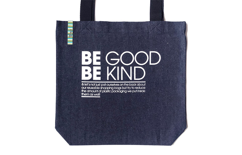
- Be Good, Be Kind — Repetition in Bolded Text
Another gold graphic design technique, using bold text to emphasise a word. In this example, when you read ‘Be good, be kind’ you’ll find in most cases that the reader will emphasise the second bolded ‘be’ compared to the first. It’s a matter of design psychology.
This technique is useful for brands who want to send a clear message, that’s easy to understand, and makes an imprint on their consumers — KISS, also known as, Keep It Simple Stupid.
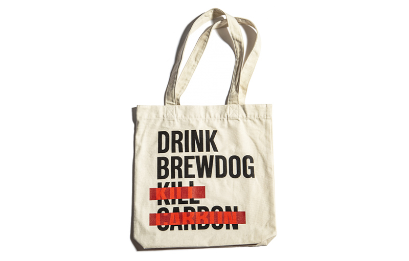
- Brewdog Brewery — Drink Brewdog, Kill Carbon
We’ve mentioned before how we love our Australia homegrown breweries, distilleries and coffee bean roasters and the merch they create. Brewdog is no exception. This clever tote bag design is designed in a way that you read the four lines of text, despite the last two being crossed out.
For Brewdog, this tote bag is sending a message to their customers that they’re opting to using more sustainable and reusable bags like this one.
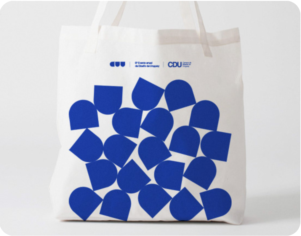
- DUy Design Event — Grouped solid shapes
Back to basics with basic shapes and solid colours. Although simple, this style does stand out from the crowd. Cleverly, they have used one shape from the logo and replicated it. It may not have an underlying message or significance, but single-coloured shapes like this are eye-catching.
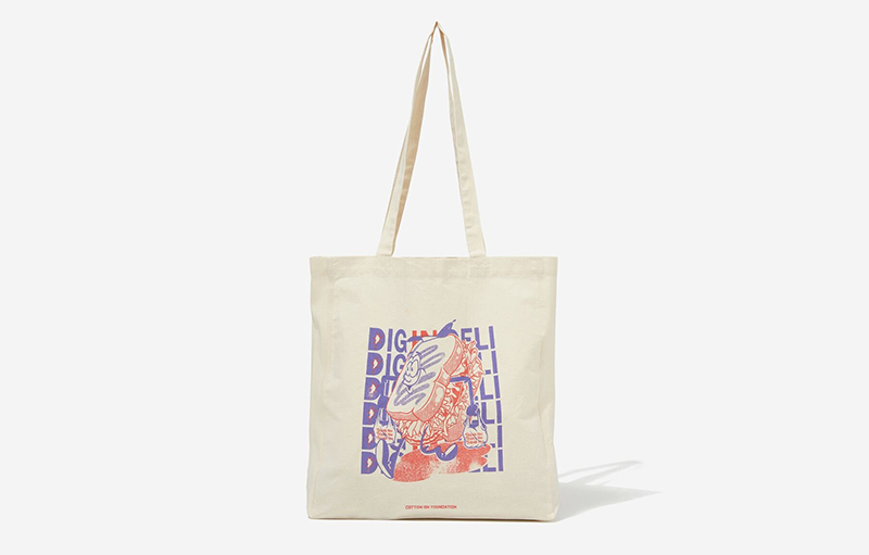
- Cotton On — Two tone graphic line & solid illustration
Cotton On is one of the leading brands in the retail tote bag world right now. All in-house designed and created, their graphic tote bags are fun, colourful and a unique accessory. The best part about this design is that it has been designed in a way so that it is a detailed illustration but not distracting. The main features of the design are the background text lines, the centre character and the primary use of only two colours.
If you have a brand icon, character or mascot, you could try something similar with your very own branded tote bags.
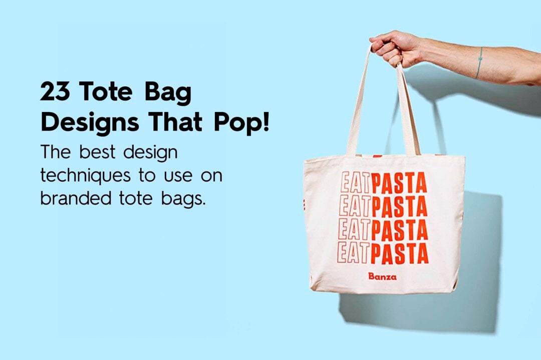
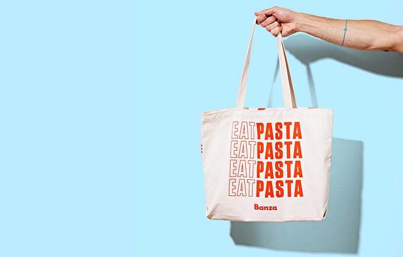
- Banza — Outline VS Solid
Another basic but effective design tactic. Outline text versus solid colour text. This creates a hierarchy within the design. For Banza, it’s all about pasta, that’s why it’s bolded. But what do you primarily do with pasta? You eat it!
This type of design is easy to create with a brand slogan, it’s a simple but standout and stand alone tote bag design.
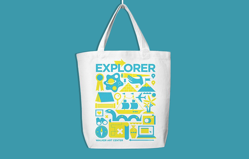
- Explorer Walker Art Centre — Two tone solid illustration
Another great example of how using only two colours can really make a tote bag design pop. We always recommend to our customers to stick to their brand’s 2 – 4 primary colours — the fewer the better!
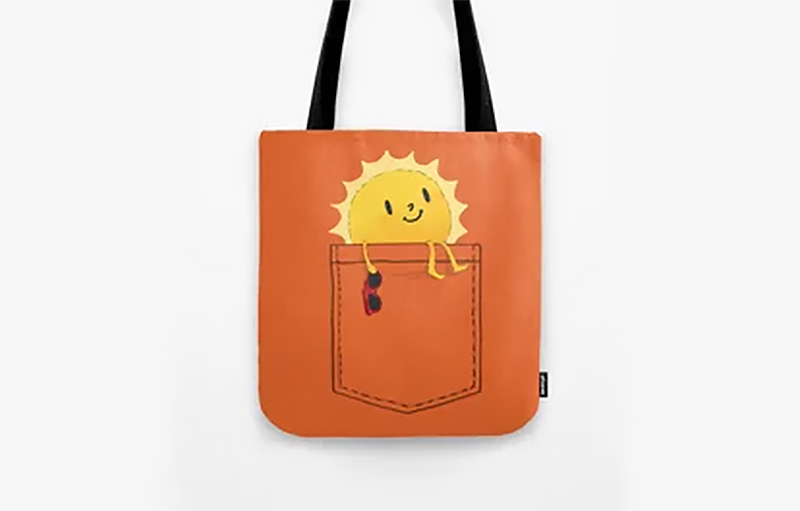
- (Fake) Pocket Full of Sunshine
This design is very fun to use. It technically falls into the ‘illusion’ type of graphic design. Placing a pocket with a cute little character poking out the top of it, although it’s not a real pocket, can make your design more engaging from a far.
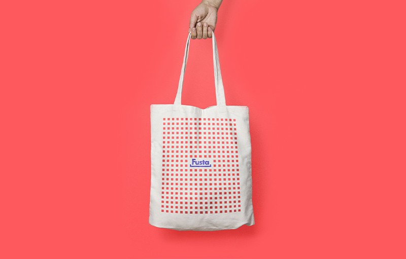
- Fusta — Lots of little shapes = grid repetition
Sometimes small things have the power to be great things. There’s no exception to this when it comes to the repetition of small shapes in tote bag designs. From a distance, those little red squares create a large border for the logo and make it the hero of the design. (Notice again how it only uses two colours!)
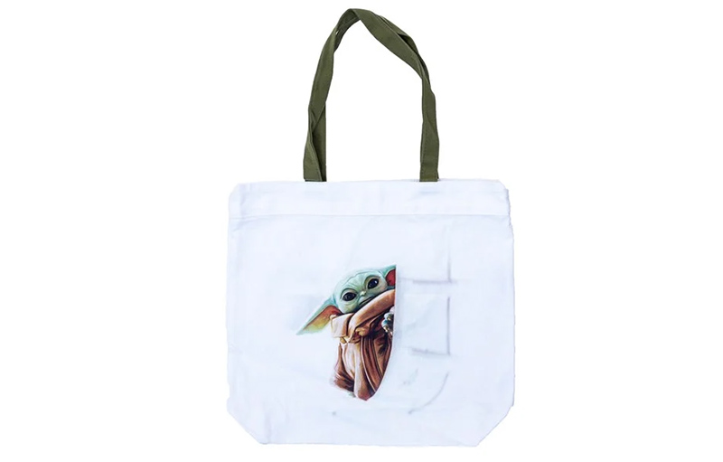
- Star Wars, Grogu — 3D shading effect
Another illusion! Just like Grogu and he jedi powers (spoilers), this type of shading effect will make the design appear to be popping out of the fabric, creating a 3D effect. It’s adorable on this Star Wars tote bag with Grogu, but I have seen this technique used on some not so cute monsters from scary movies too..!
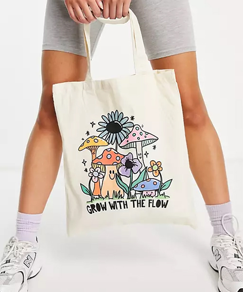
- Grow With The Flow
Storytelling time! Creating picturesque scenes with lots of colours will draw your tote bag design to more the child-like and young-at-heart storyteller consumers. This type of design is perfect for library book bags, book releases or for artistic renditions of a movie or TV series.
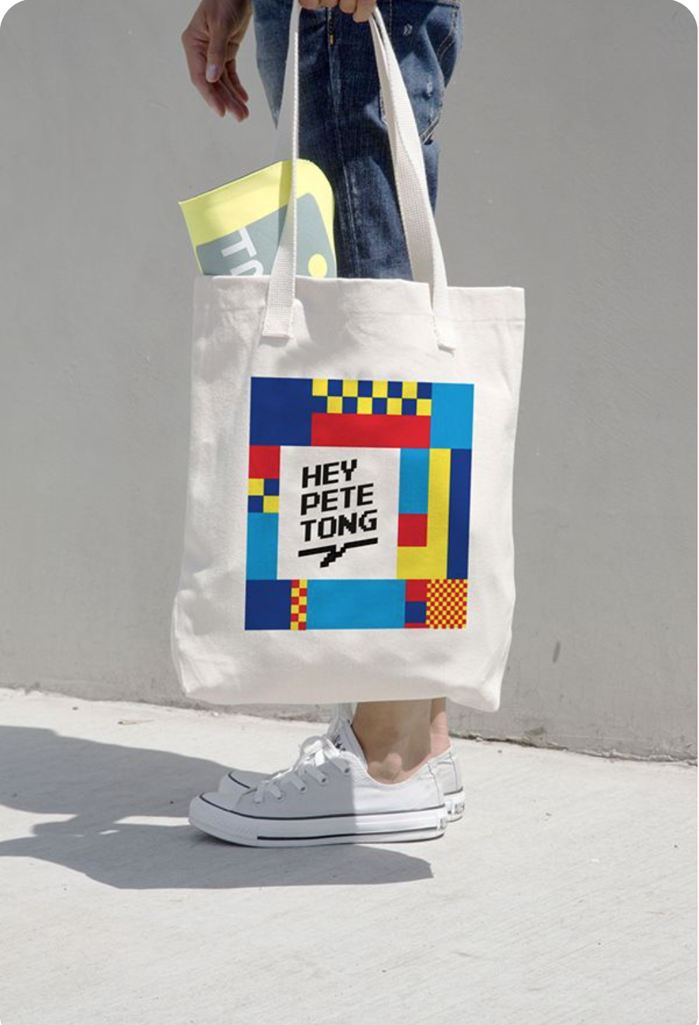
- Hey Pete Tong — Border your text
When we say ‘border your text’ we don’t mean whip out Word 2010 and put a colour border around it. Please don’t. Introducing the design principle of White Space. Notice how around the ‘Hey Pete Tong’ text is an equal amount of ‘white space’. The a solid and equal graphic border that frames the text. This gives the tote bag a frame to the design, but doesn’t take away from the message.
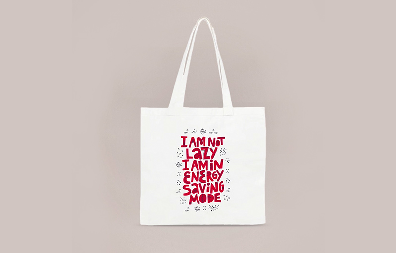
- Energy Saving Mode — A funny phrase
Bring it back to the people. Humans are wired to understand relevancy and are empathetic creatures. So use a funny phrase that you know your consumers will enjoy. For example, this ‘I am ont lazy, I am in energy saving mode’ tote bag design would be a very funny bag for an IT or tech company to make.
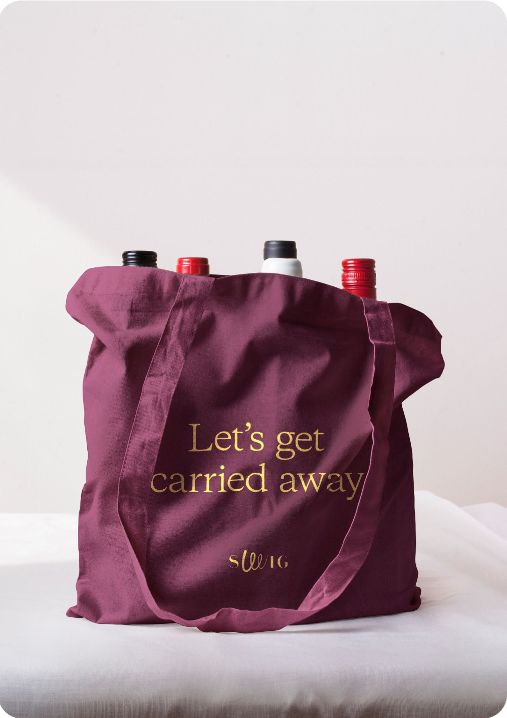
- Swig — Let’s Get Carried Away
Be pun-ny. This wine brand from the north of London, took their tote bag phrase seriously — talking about carrying their wine in the bag, I’m sure they were encouraging responsible drinking… “Don’t get carried away’ is a very common phrase said when you’re about to go to the pub and have a couple of pints. Well, Swig turned the phrase on it’s head. Changing it to ‘Let’s get carried away’ referencing the fact that the tote bag will be carrying the purchased wine. Clever and funny.
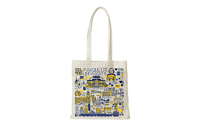
- Marquette University — Popular places to visit
Some of you may remember going to University or College open days and being passed a plain tote bag with the University’s badge printed on the front — yay, how exciting… It’s doesn’t really scream,Welcome to the community! That’s why Marquette University has created a story for their students, highlighting the popular places they’ll see and visit if they were a student at the university. Once you’ve finished your degree, you’ll be able to look back at the bag and think, ‘I’ve been to all of those places’. (Again, only 2 – 3 colours used, getting the hint?).
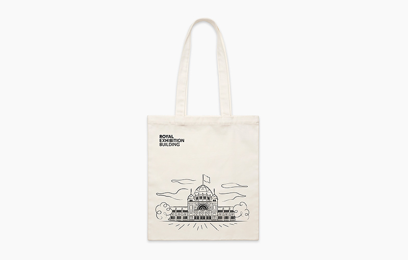
- Melbourne Royal Exhibition Building — Line drawings
You can’t go wrong with a simple but beautiful line drawing, especially when it outlines a beautiful building like the Royal Exhibition Building. Simplicity is sometimes what makes a design striking. As for this tote bag, if someone in Melbourne carried this around almost everyone who saw it would recognise the line illustration. You could implement this design technique to a product or even for an event, illustrate an iconic landmark or structure that will remind your attendees of where the event was.
- No Brand — Colours and Solid Shapes
Abstract designs can take many forms, but unusual shapes are a great go-to if you’re looking for something slightly edgy. You could very easily place your logo underneath these shapes and create a colour tote bag collection — perhaps with a GWP campaign, every purchase you get a different version of the tote bag range. Just an idea!
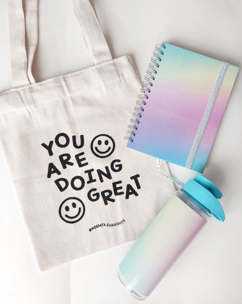
- Posdata-Cuadernos — Wavy text and smiley faces
Wavy text has definitely made a comeback in the last couple of years since the return of 70s and 80s fashion trends. Tote bags with wavy text are the perfect complementary fashion accessories for these new fashion trends. It’s literally groovy, fun and different. You don’t see it often but when you do, you know that brand means fun.
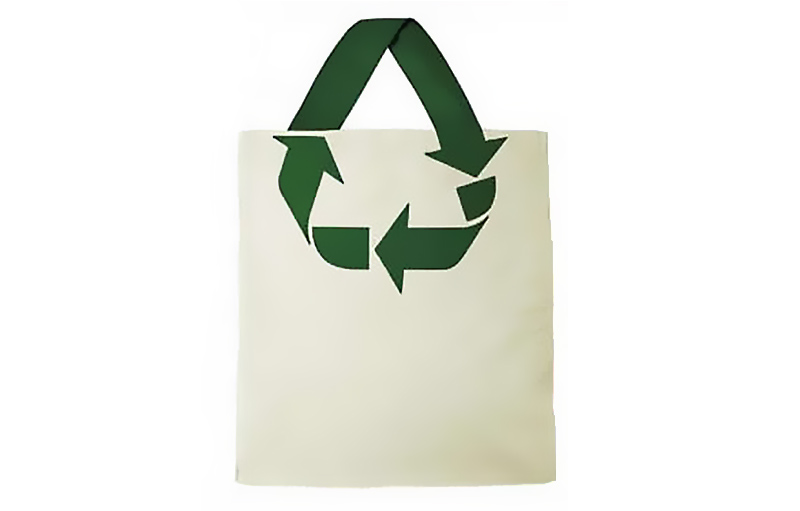
- Recycle Symbol — Incorporating the handle
Clever design should be seamless, so good that you almost don’t notice it. This tote bag is an excellent example of this. The recycling arrows symbol is a very recognisable symbol and this design incorporates the top arrow as the handle of the bag.
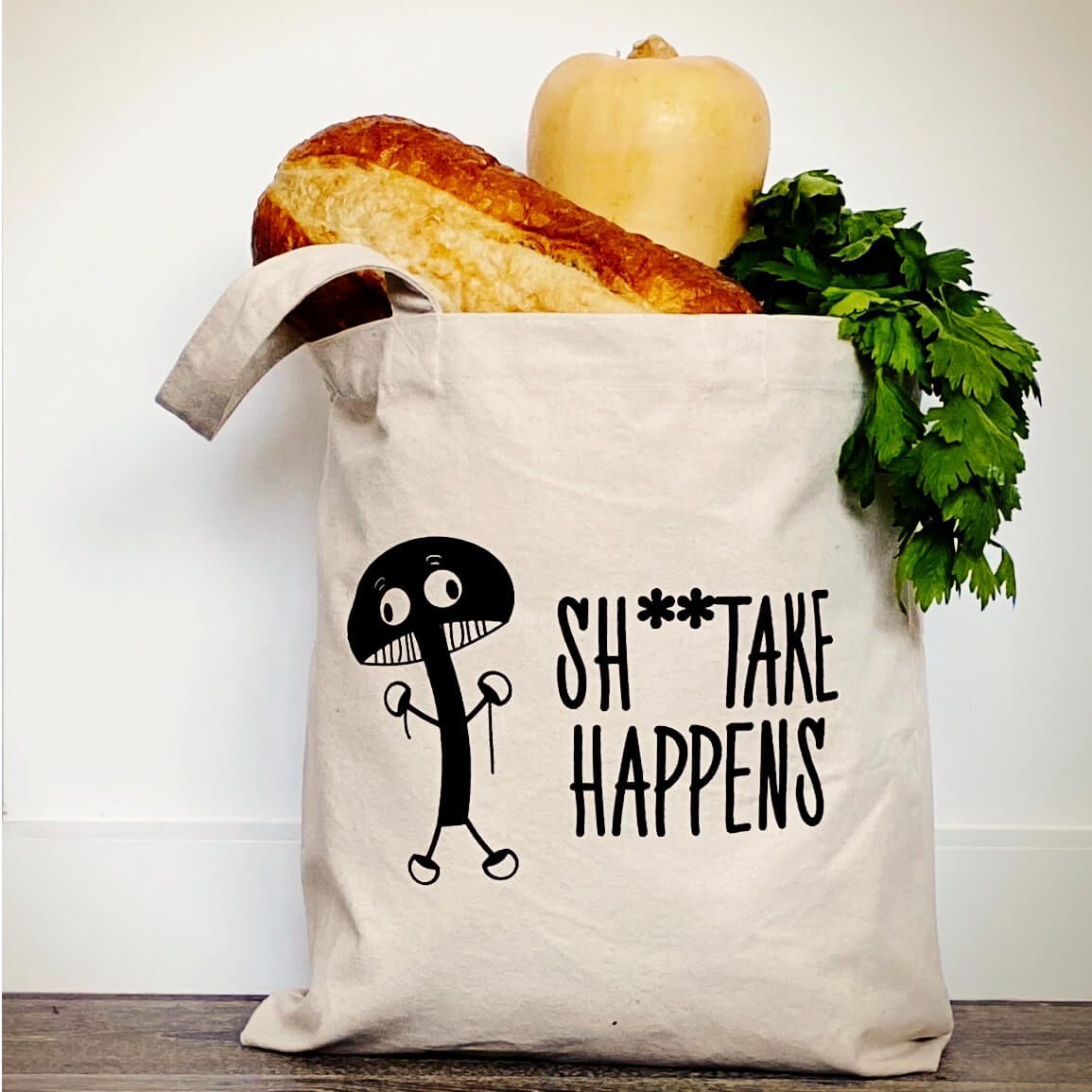
- Shiitake (Mushrooms) Happen — Play on words
There’s a fine line between being funny and being inappropriate. Using a play on words means you need to think carefully about how it will be read and interpreted by your consumers. This Shiitake mushroom tote bag is a great example of how a local grocery or market store owner could engage their customers with a funny shopping bag.
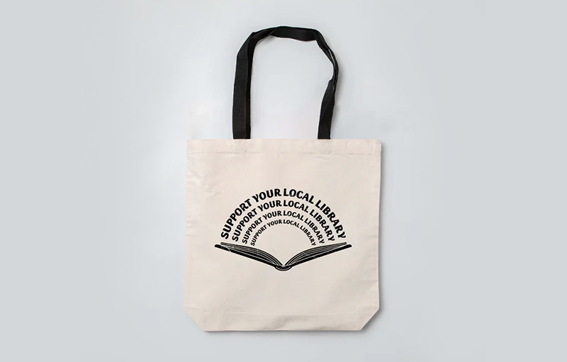
- Support Your Local Library — Familiar symbols
There are universal symbols that many people recognise. For example, a hexagon usually means stop, a coffee cup usually means a cafe is nearby, and an exclamation mark usually means caution. The same can be considered for an open book meaning library or bookstore. Using familiar symbols like this can make your tote bag’s message and branding more obvious to consumers, as they can assume the meaning of the symbol.
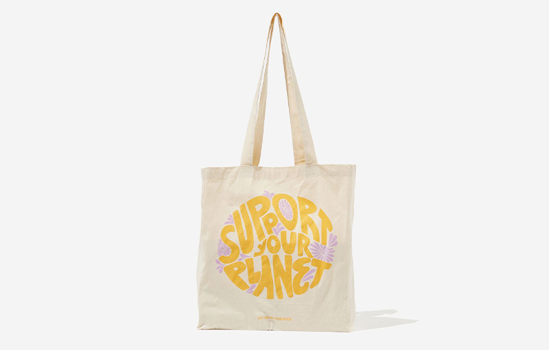
- Cotton On — Circle framing
We’ve seen lots of examples in this list of rectangle and square printing areas on tote bags. But there’s no rules against changing it up and using a different shape to frame your design! This Cotton On example shows the words ‘Support Your Planet’ in the shape of a circle, complementing the double meaning of it looking like a planet. A circle stands out more on a tote bag as it doesn’t follow the natural lines of the product — something to keep in mind.
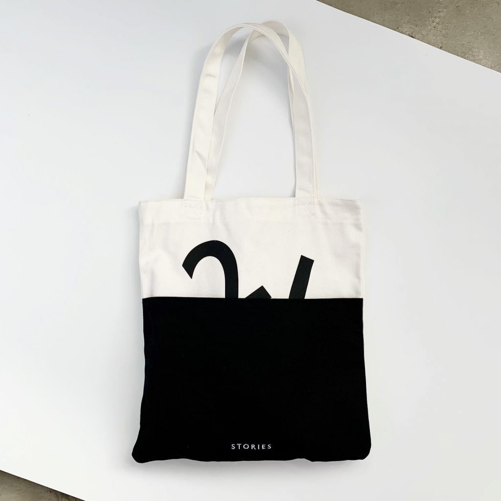
- Stories — Use of silhouettes, and Black & White
Black and white is the perfect way to show that your brand is sleek and stylish. Thick black lines or solid areas could represent your brand as modern and edgy, while thin black lines could represent elegance. Silhouettes is another smart way to use black, as our minds will fill in the blacks and understand the shape the silhouette is making. For example, although half of this tote bag is black, the arms of the ‘W’ sticking out make us visualise the rest of the ‘W’ subconsciously.
Summing up…
In recent years, tote bags have been on the rise. As sustainability becomes a focus for many brands, offering reusable bags instead of single-use plastic is the way of the future. In fact, many cities and countries have implemented laws and regulations to restrict the use of plastic bags.
Using reusable bags, like tote bags, brings more creative freedom compared to single use plastic bags too. Brands now have the ability to add their story, tone of voice and branding to the bags their consumer purchase products in or whatever purpose the tote bag entails. Whether it’s for an event, a GWP or to expand your accessories in your store. Get more creative with your tote bag designs — don’t just ‘slap a logo on’. Plus, remember, the best tote bag designs that really pop only use 2 or 3 colours.
If you need help creating an awesome tote bag design then get in touch with our team. We create artwork mock-ups for free with our incredible Graphic Design team. Just another good thing here at Good Things.